7 Design Trends to Update Your Brand in 2024
The one constant in design is that the trends always changing. Whether you want to overhaul your brand or just add some subtle updates to modernize it, it’s important to know what’s currently popular.
Many of the styles that are appearing this year stem from a backlash to the quiet minimalism that dominated the last decade of design. Clashing colors, bold geometric shapes, and quirky fonts are back in style. There’s also a strong feeling of pre-digital nostalgia with styles like risographs or illustrations gaining popularity.
Overall, the design pendulum is swinging back towards more maximal, fun designs loaded with personality. However before you jump into a full brand refresh, it’s important to pick and choose which elements you want to embrace.
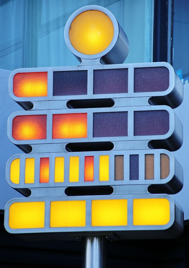
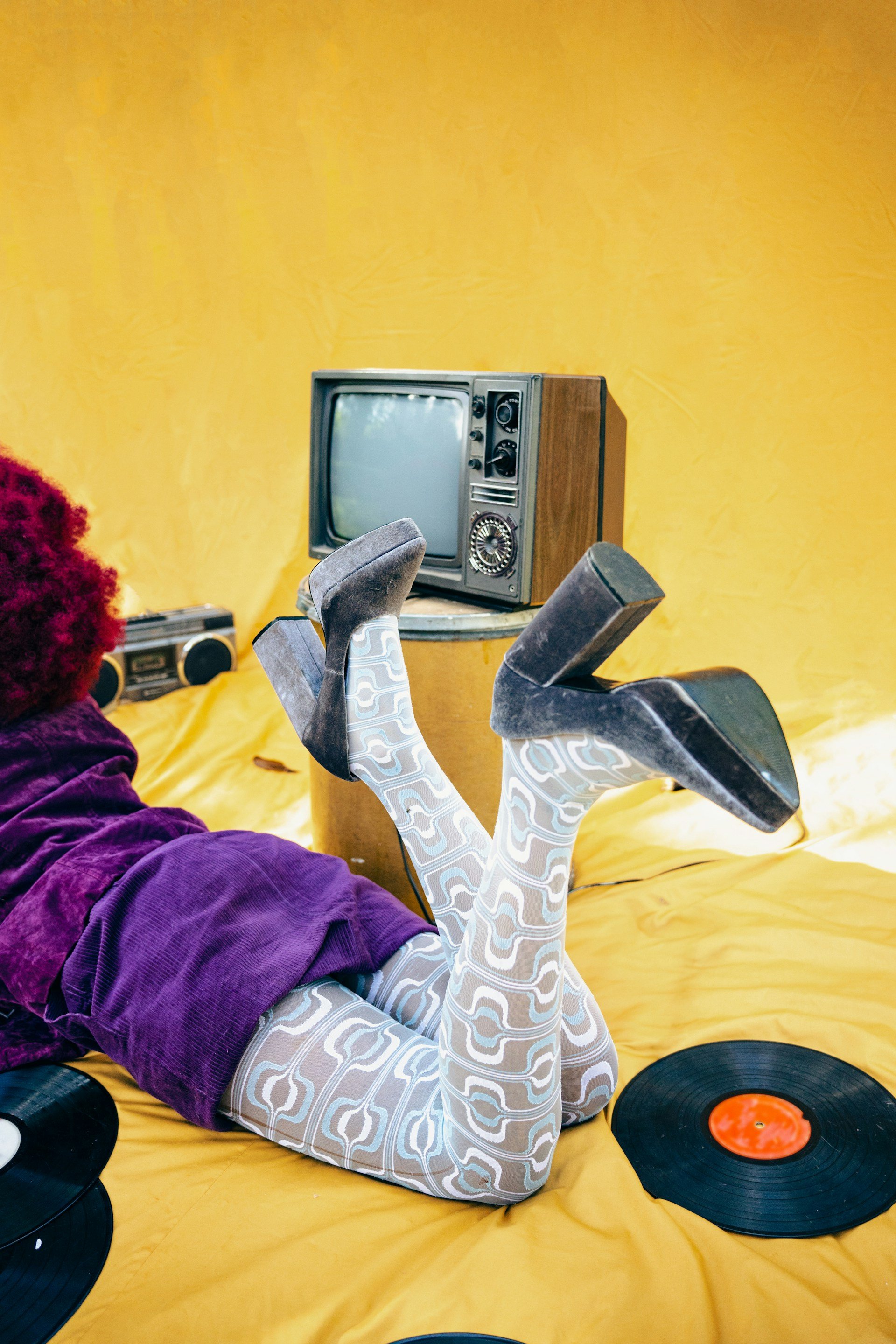
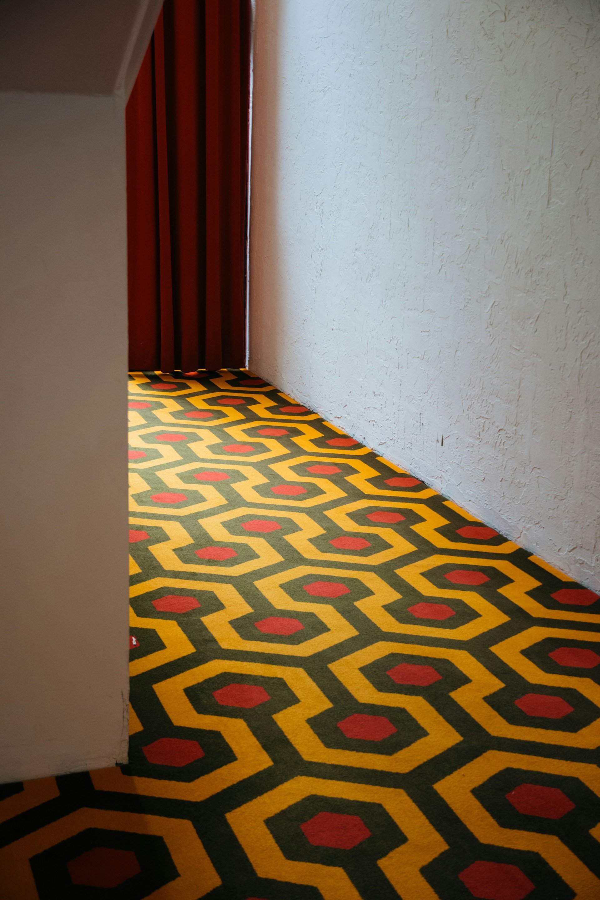
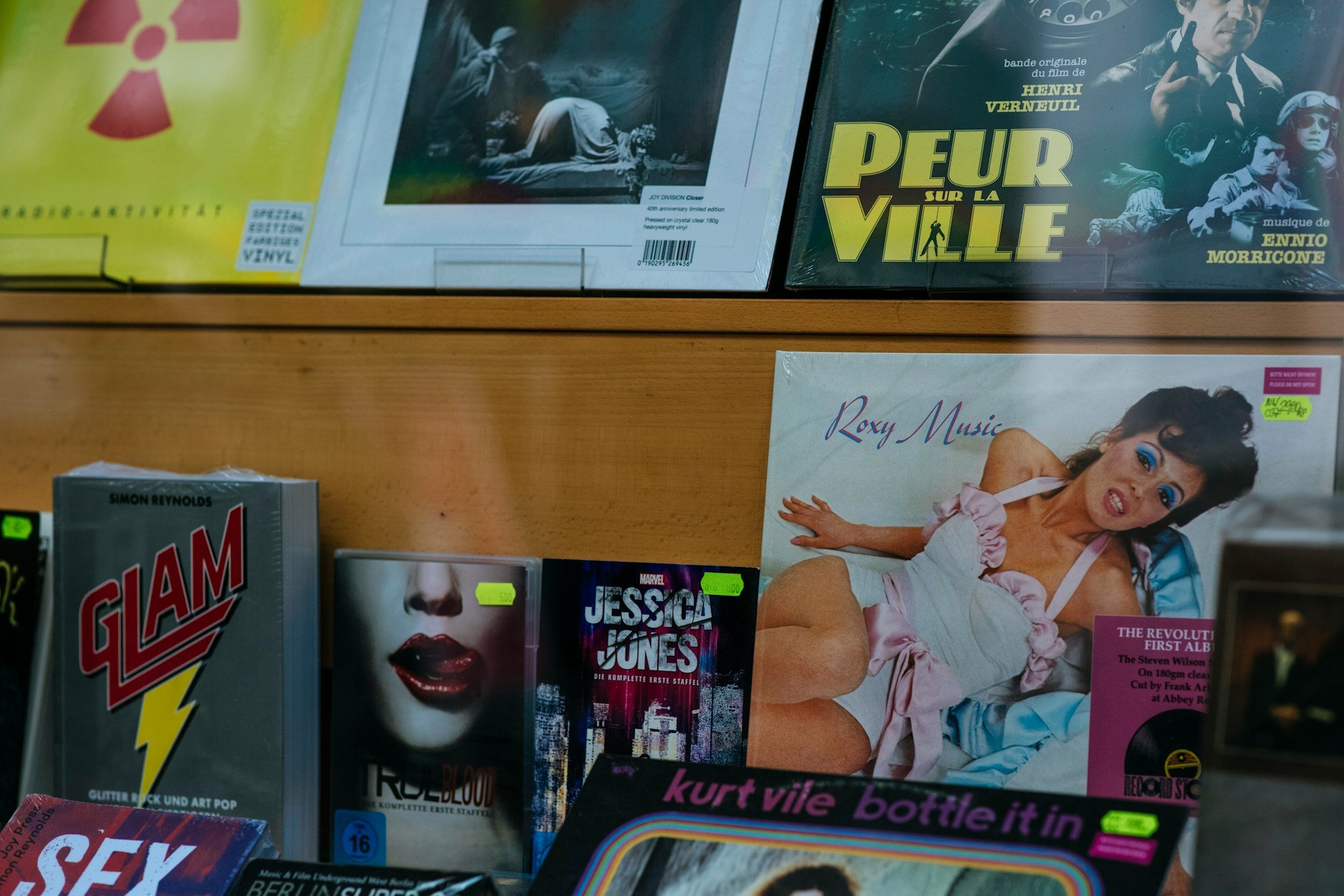
Retro Nostalgia for the 60s and 70s
With technology advancing at lightning speed, it's no wonder we’re collectively taking a step back to earlier times for inspiration. While 2023 was all about Y2K styles, now we’re starting to seek inspiration from an even earlier period.
We landed on the moon in 1969 and the 1970s were the decade when personal computers first became available (though not widespread). This era held a lot of both futuristic excitement and dread toward advancing technology. With the advent of AI and associated uncertainty, it’s unsurprising that we’re fixated on this era’s designs.
Funky patterns and designs inspired by the ‘60s and ‘70s are reappearing along with unusual color palettes, quirky fonts, rounded corners, and whimsical artwork.
I cover this trend first as it gives context to many of the other design trends we see emerging this year. While most brands won’t want to go all in on a retro rebrand, it’s a rich era to draw inspiration from.

“Cat Hair Don’t Care” by our lovely illustrator Kaela
Illustrations for Whimsy and Personality
In 2024, illustrations are making a big comeback. Friendly and quirky illustrations add a human touch making brands feel more relatable and break from digital overload.
There are a few reasons for this — our brains have a stronger emotional reaction to images than text and process illustrations much faster and easier photos. This means a few well-placed illustrations can not only give your audience a visual break but help them understand and remember your message.
One easy way for lifestyle brands to explore this trend is by replacing vectorized icons with small illustrations or adding illustrated elements to their social media feeds. Even for traditional brands, simple line drawings can add a human touch.

Bold color pattern, Furi Sport
Bold and Unusual Color Combos
Forget playing it safe with color in 2024. We’re seeing the backlash from years of soft beiges and pinks, it’s time to embrace the vibrant side of the color wheel! We're talking bold clashes and unexpected pairings that grab attention and make designs stand out.
While the 60s and 70s revival is certainly responsible in part for these wild color palettes, some of the boldness might also be coming from brands’ trying to meet the AA WCAG Web Content accessibility guidelines which encourage high contrast. Part of it also might be the resurging interest in the anti-design movement that is intentionally loud and messy.
It’s not a look I’d recommend for every brand but when done well, it can be very attention-grabbing and memorable. In any case, expect to see more daring and unconventional color combinations.

Gradient illustration, VivaEve
Abstract Gradients and Color Transitions
Gradients have been popular for a few years now but they’re getting a modern makeover in 2024. Say goodbye to subtle fades and hello to daring, artistic color transitions.
Gradients are following the color trend towards bolder and unpopular or clashing color combinations — there’s also a trend to more complex gradients rather than purely linear ones.
Abstract gradients can be used to add depth and dimension to your designs and are extremely versatile. They can be used as a background to attract attention to text or as abstract artwork in and of themselves.
One thing I love about the gradient trend is it fits a range of brand profiles from elevated healthcare or luxury brands to the dynamic energy of tech.
Aesthetic and Functional Curves

Rounded call to action button, Fernweh Editions
Say goodbye to hard edges and hello to smooth curves ahead. This trend is all about softening the edges and creating a more welcoming aesthetic. Whether it's a “squircle” or a rounded rectangle, curve smoothing adds a touch of friendliness to your designs.
As mentioned above, many of 2024’s design themes are inspired from designs from the 60s and 70s that embraced a more organic, fluid line.
Part of this was inspired by the aerodynamics of the space race as well as improved manufacturing and printing techniques.
Curves and organic shapes also visually reflected the zeitgeist of the time — a youthful counterculture movement relaxing rigid cultural norms.
However, this trend is not purely about aesthetics. From a psychological perspective, rounded edges appear softer and safer than rigid 90-degree corners, therefore we’re more apt to interact with them.
This has lead many large tech players to convert to rounded edges for instance, YouTube changed their buttons from square to rounded corners in 2022 because it encouraged more interactions.
Even brands that aren’t ready to go full in on rounded edges, might explore changing their digital buttons to a rounded corner and A/B test if that produces more interactions.
Serifs and Display Fonts Are Back!

Serifs are back!, cuvée beauty
As a typography lover, I am thrilled to announce serifs and display fonts are back! When minimalist design reigned supreme, it was rare to see brands using serifs much less quirky display fonts.
A great case study in this is Burberry’s recent rebrands. In 2018, Burberry re-designed its logo to embrace a more modern and minimalist identity.
The new logo was a monolithic sanserif and many other designer brands also re-designed their logos during this period so that they were, from a typographic standpoint, almost indistinguishable from each other.
In 2023, Burberry once again redesigned its logo. This time the logo was inspired by the heritage and handmade craftsmanship of the brand and included serifs.
Furthermore, they re-introduced the illustrated knight which had been removed in the 2018 redesign, following another current trend.
Beyond just serif fonts, display fonts have made a strong recovery. Wide, condensed, and novelty fonts are everywhere.
3D fonts that look like they’re popping right off the page are popular and decorative fonts inspired by the 60s and 70s are also back in style.
While I love a beautiful Helvetica(-ish) font, it’s a pleasure to see lush typographical variety again.
Geometry Everywhere

Geometric shapes, SMP Pharmacy
From simple shapes to complex patterns, geometric designs are trending in 2024. One reason for renewed interest stems from the 60s and 70s revival with its trippy, color-intensive geometric patterns.
Similar to illustrations, geometric shapes are easier for the brain to process and provide a mental break.
What I enjoy about this trend is how accessible it is to a wide variety of industries. You can use simple shapes to create visual order and hierarchy or add an element of playfulness.
Conclusion
Find some new trends you can’t wait to implement on your brand?
First, consider whether it is relevant to your values, audience, and brand. While trends can be inspiring, brand consistency is often more important, especially if you’re a well-established brand.
That said, when it feels appropriate, adding these trends to your brand can make it feel up-to-date and relevant in 2024.
Need some help updating your brand? Let’s chat!